Filters

Content Type
Topic
How are Top Companies Enhancing User Experience?

Before the pandemic disrupted our ability to freely travel, a term was rising to prominence called the “experience economy.”
Millennials led the surge in demand for more experience-based purchases and less material things.
Some wonder if the experience economy as we knew it in 2019 will ever fully recover. It no doubt will eventually, but for now, there are other types of experience that matter too.
Like everything else, the things people seek, expect, and crave as consumers don’t suddenly disappear when they get to work at their B2B office.
Your business buyers are the same people they were in the morning as they scroll Reddit while drinking their coffee.
The lines were already blurring between B2B and B2C marketing before the pandemic. Now with people working remotely, they keep blending.
Hence, the need to enhance user experience.
In fact, experience matters much more for B2B.
You’re competing in crowded markets. Differentiating yourself by price point isn’t smart. It’s not effective either because 86% of buyers say they’re willing to pay more for the same product if one includes a better experience.

How to Improve User Experience on Your Website: 8 Important Factors
With all business happening virtually, the experience you provide via your website and customer service is your best chance for earning loyal customers. Here’s what an awesome user experience should look like on a B2B site.
1. Mobile-First Browsing
2. Personalized Content Recommendations
3. Endless Content Streams
4. Minimalist Forms
5. Custom Pricing and Offers
6. Seamless Navigation
7. Straightforward Buttons
8. Interactive Design
How to Enhance User Experience with Inspiration from Top Companies
Some of the examples below are consumer brands but that’s irrelevant where experience is concerned. Everyone wants a seamless and interactive website – even if they don’t realize it.
Roku
Unsure how to improve the user experience on your website? Trim it down. Keep things simple.
Roku gets it.
Roku’s site has all the features you could possibly need but it’s so streamlined you don’t even realize it.
On each channel page, Roku includes large interactive buttons. Each button clearly describes exactly what it does. There’s no confusion.
Here’s the best part. The Install button starts purple and white like the rest of the Roku buttons.
When you click it, however, the button switches to red and gray, and the text changes to Installed.
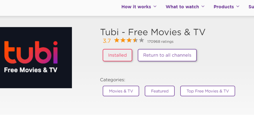
It’s so simple but it makes browsing the channel store and installing channels to your TV so smooth.
Speaking of the channel store, we can clearly see right away which channels are already installed thanks to the red and purple buttons.
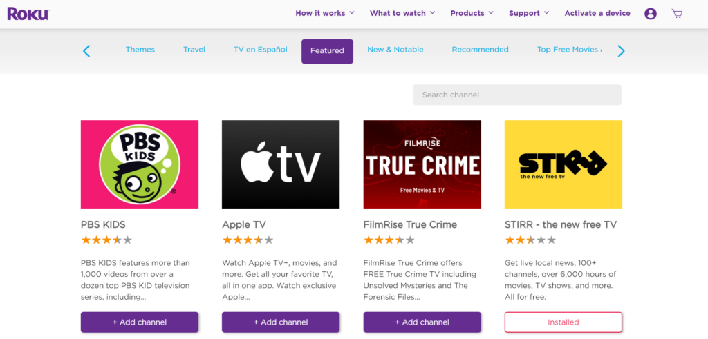
Plus, the two menus make it effortless to find what you need.
The top menu describes basic functions while the second menu categorizes the available channels, allowing you to scroll as you browse categories.
Channel descriptions are concise, photos are large, and there’s absolutely nothing you don’t need clouding the page.
Gmail
Google is no stranger to awesome user experiences.
A few months ago, Gmail added a feature that alerts you if you attempt to send an email with “please see attachment” in the copy but forgot to upload any attachments.
Gmail also lets you set up a timer so you can unsend emails up to 30 seconds after you’ve sent them.
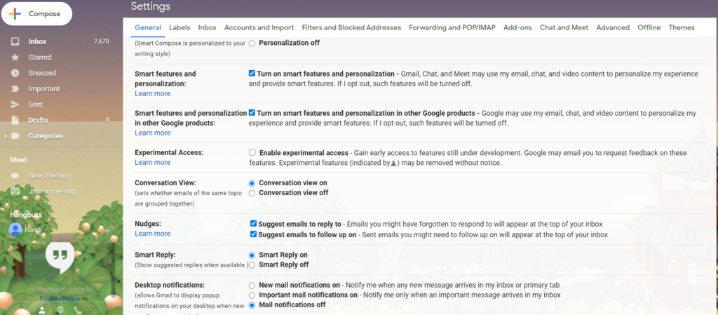
It doesn’t stop there though. Opening your Gmail settings leads to a ton of personalization and customization options:
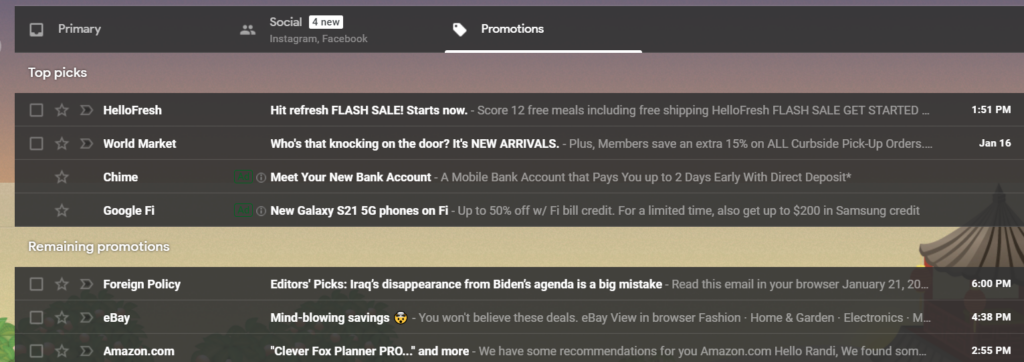
Gmail also takes it upon itself to organize your inbox with primary, social, and promotional tabs. Within the promo tab, Gmail even prioritizes which emails it thinks you’d like to see first.
KWFinder
KWFinder is an SEO and keyword research tool.
Like all awesome design, KWFinder’s homepage is simplistic and interactive with only a handful of menu items and the primary function smack in the center:
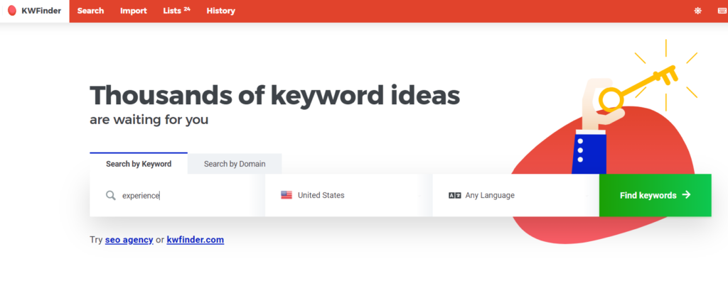
There’s minimal copy as to not distract you and a little explainer under the main search input. Plus, the CTA button is bright green to make sure it stands out from the rest of the red imagery on the page.
Once you search, KWFinder opens an interactive experience.
Despite the screen being loaded with varying stats and information, it’s still easy to scan and find what you need.
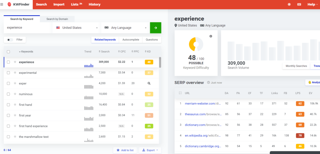
Different difficulty ratings are color-coded since that’s one of the most important stats.
Everything is where you expect it to be and again, the CTA button to search another keyword is bright green to stand out.
Amazon
Finally, we can’t talk about enhancing user experience without mentioning Amazon and their industry-leading personalization.
Plus, 69% of B2Bs say they expect an Amazon-like shopping experience from your website.
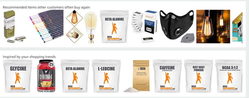
Amazon knows their personalized recommendations drive most of their revenue.
That’s why they include personalized recommendations for products people often rebuy:
One issue with Amazon’s experience is the menu. Rather, the three menus.
Their main menu is extremely convoluted once you start opening the dropdown tabs.
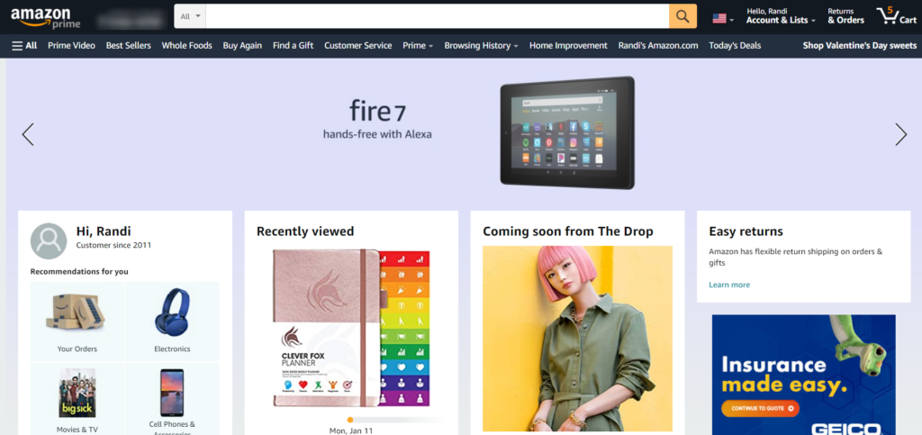
Notice along the left side of the screen there’s a hamburger menu that opens random generic tabs.
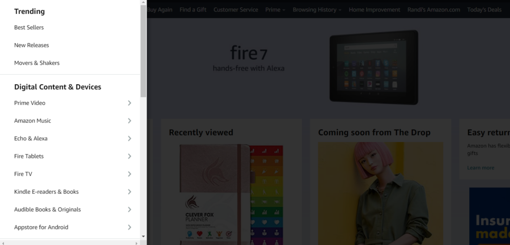
Finally, along the right side of the screen, above the main menu, there’s another menu to manage your orders and account details.
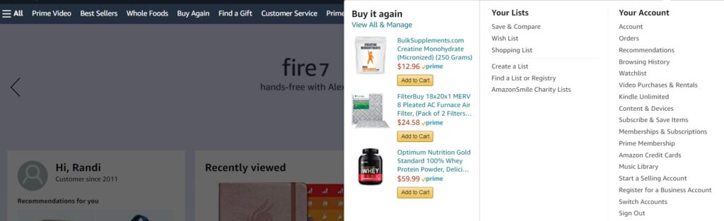
Even that menu opens to two full menus along with a widget with personalized recommendations!
Maybe Amazon is following the common in-store strategy of making the shopping experience overwhelming and confusing so you stay on the page longer. There’s no way they don’t have an entire team constantly enhancing their website experience.
Your All-in-One Tool to Enhance User Experience
You really don’t need to pay for five different martech tools to create the personalized experience your website visitors deserve. One AI-powered tool delivers eight different features you can customize to suit your unique brand and audience.
Hushly helps B2B companies enhance user experience across their websites with AI-driven personalization tools like content recommendations, ABM campaign pages, smart micro-forms, self-nurturing content feeds, and much more.
Our platform is user-friendly (because we know experience is important), straightforward, and templatized to make your job seamless.
See why so many businesses trust Hushly to engage their audience and improve the user experience for customers across their website.

The post How are Top Companies Enhancing User Experience? appeared first on Hushly.