Filters
Content Type
Topic
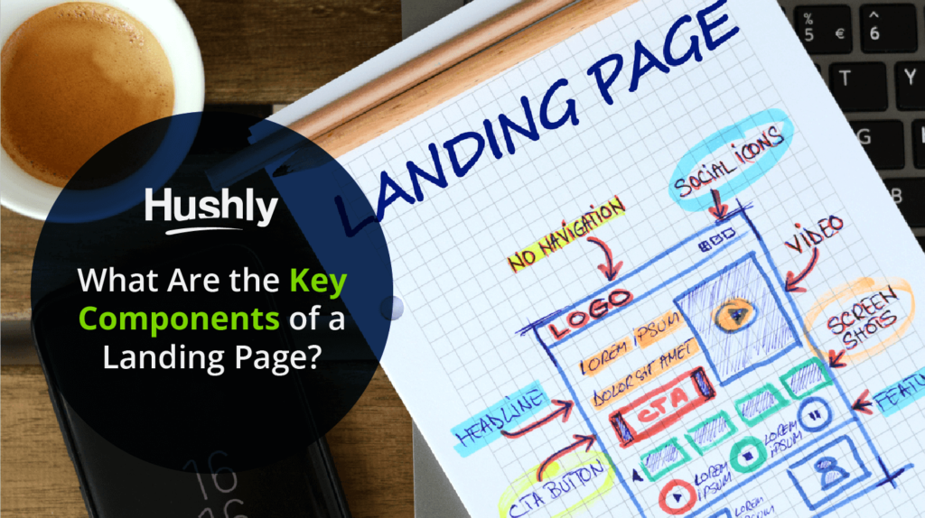
What Are the Key Components of a Landing Page?
A business should have a dedicated landing page when it wants to achieve a specific marketing objective, such as driving conversions, generating leads, or promoting a new service.
Landing pages allow businesses to create a customized and focused experience for their target audience, increasing the chances of achieving their marketing goals. A targeted landing page will make it easy for businesses to control the message for a particular campaign, allowing them to track the campaign’s success better and adjust accordingly.
However, the many possible elements of a landing page can be daunting, especially if you’re designing one for the first time.
An effective landing page usually has eight key components. We’ll explain how you can implement them to start increasing your conversion rate today.

What Is a Landing Page?
A landing page is a standalone web page that is designed with a specific purpose in mind, usually to convert visitors into leads or customers. You can use landing pages for various purposes, such as:
- Promoting a product
- Capturing leads
- Selling a specific item
The main goal of a landing page is to provide a focused and relevant experience for visitors by guiding them toward a specific action, such as filling out a form, making a purchase, or downloading an offer.
8 Key Components Every Landing Page Should Have
Landing pages should be unique and fresh for every campaign they’re used for. Special considerations to take when creating landing pages include the target audience, industry, and product or service you’re trying to sell.
Here are the key components of a landing page that can help you accomplish your marketing objectives:
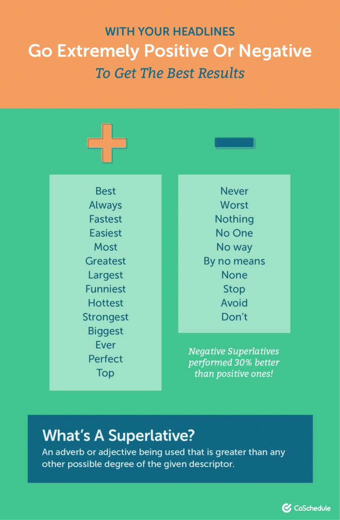
1. Attention-Grabbing Headline
The headline should clearly communicate the purpose of the landing page and what the reader can expect to gain from it. Make sure it is concise, easy to read, and relevant to the target audience.

Source: CoSchedule
A strong headline should:
- Use attention-grabbing language. For example: “Want to increase conversions? Do this…” or “Limited Time Offer.”
- Clearly communicate the purpose of the page.
- Emphasize short, punchy sentences that get your point across fast.
- Target your audience with industry jargon and relevant messaging.
2. Clear and Valuable Offer
Your offer motivates the reader to act, so it should be related to the headline, solve a specific problem of the target audience, and stand out from the competition.
A clear and valuable offer should:
- Invoke the target audience’s pain point and promise to resolve it.
- Stand out from the competition by offering realistic results or adding huge value.
- Be relevant to the target audience by proving subject matter expertise.
- Directly address your landing page’s headline.
3. Fast Load Time
A slow-loading page can lead to frustration and decreased conversions. To ensure fast load times:
- Optimize images: Compress images to a reduced file size. Find the balance between quality and size.
- Use a reliable hosting provider.
- Try to limit HTTP requests (requests to the server for things like images, scripts, and stylesheets).
- Consider using a content delivery network (CDN) if you get a lot of traffic from around the world.
4. Context Within a Buyer’s Journey
The landing page should align with the buyer’s journey and take into account where the target audience is in the process. This will ensure that the messaging is relevant and that the reader is guided toward the desired outcome.
To ensure your landing page is always contextual within a buyer’s journey:
- Know your target audience: Perform thorough research and create in-depth buyer personas to ensure you fully understand your buyer’s needs and concerns.
- Map the buyer’s journey: A key step to knowing what stage the buyer is at is knowing the whole journey from start to finish. Make sure you know what each step (awareness, engagement, and decision-making) looks like for your target buyer.
- Use dynamic content: Use a platform like Hushly that will allow you to create self-nurturing, dynamic landing pages for each of your audience segments. This will ensure you’re always displaying the most relevant message to each buyer.
5. Seamless Experience
The landing page should provide a seamless experience for the reader, from arrival to conversion. This means that the landing page should be consistent with the messaging and images that were used to drive traffic to the page.
A seamless experience means:
- Easy navigation
- Mobile optimization
- Minimal distractions. Only the most relevant information.
6. Clear Path to Conversion
The landing page should guide the reader toward the desired outcome, which is typically to fill out a form or make a purchase.
A clear path to conversion should:
- Use clear, prominent calls-to-action (CTAs). CTAs should be visually appealing and impossible to miss.
- Include directional cues like arrows, images, or any visual that direct a user’s attention to the conversion goal.
- Have a simple, easy-to-use form. Avoid overwhelming information or distracting elements.
7. Scarcity
Scarcity is a marketing tactic that focuses on creating a sense of urgency and limited availability for a product or offer. This is done to encourage consumers to take immediate action or miss out on a valuable opportunity.
To create scarcity on your landing pages, try any of the following tactics:
- Limited time: Offer your product or service for a limited time to create a sense of urgency among your audience to act now. Include countdown timers and language like “ending soon.”
- Limited quantity: Indicate that your product or service is in high demand and has limited supply. Include “spots remaining” counters to indicate the offer is almost used up.
- Last chance: Emphasize that this is the last chance for your audience to buy your offer and that they shouldn’t expect to see it again.
8. Video
Video can be a powerful tool for increasing conversions on landing pages. To make the most of this tactic, consider the following:
- Highlight the benefits: Show how your product or service solves a problem or offers a unique benefit.
- Keep it short: Aim for a video that is under 2 minutes in length.
- Make it visually appealing: Use high-quality visuals, graphics, and animation to make the video engaging and memorable.
- Include a call-to-action: Make sure your call-to-action is clear and concise. Only provide one CTA per video to avoid overwhelming your viewers with too many options.
- Test different variants: A/B test different versions of your video to see which one resonates best with your target audience.
Hushly’s Platform Can Make Designing Great Landing Pages a Breeze
By following the key elements outlined in this guide, you can create landing pages that are tailored to your target audience, generate leads, and drive conversions. Remember that a landing page should load fast, be relevant to a buyer’s journey, and have a clear path to conversion.
When you’re ready to take your landing pages to the next level, consider Hushly. Our platform offers self-nurturing, dynamic landing pages that are optimized to meet your unique marketing objectives.
Contact Hushly today to request a demo and start increasing your landing page conversions.
The post What Are the Key Components of a Landing Page? appeared first on Hushly.


